Pre & Post Covid Analysis
Survey responses were gathered both before and after the Covid-19 lockdown in 2020, offering a unique opportunity to explore how customer segments might have shifted during this period. However, as with our previous analysis, applying unsupervised learning to these subsets is challenging due to high-dimensional data and relatively small sample sizes. To address these issues, I will employ the same autoencoder latent space clustering framework that I used earlier, ensuring a consistent and robust analysis across both time periods.
Training & Elbow
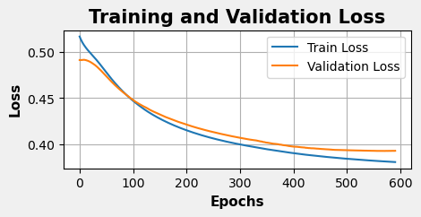
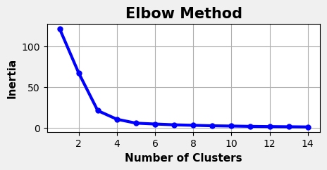
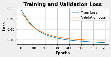
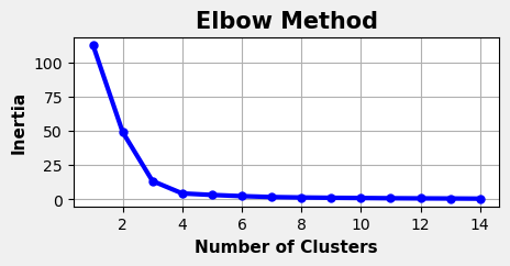
The training histories and inertia plots for the Pre and Post Covid data splits are shown below, generated using the same methods as the combined dataset analysis.
Pre-Covid
Post-Covid
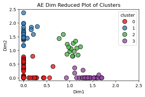
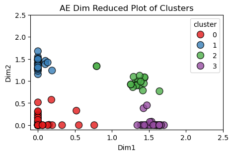
Latent Space Cluster Visualizations
The scatter plots below compare the latent space clustering results from both the Pre and Post Covid splits in the data. Each point represents the collection of responses to the same survey from one individual. There were no repeated respondents, so all the people in the Pre-Covid plot are different from the people in the Post-Covid plot. However, it is interesting to see that the autoencoder recognized similar patterns amongst respondents and gave similar shaped clusters in both outputs.
One difference that is worth noting is how the Post-Covid clusters are more dense with dinstinct groupings while the Pre-Covid clusts are visually more spread out. The higher silhouette score further supports this observation.
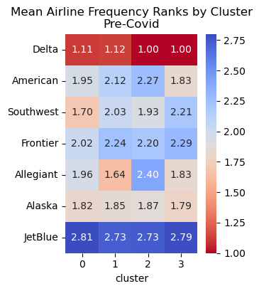
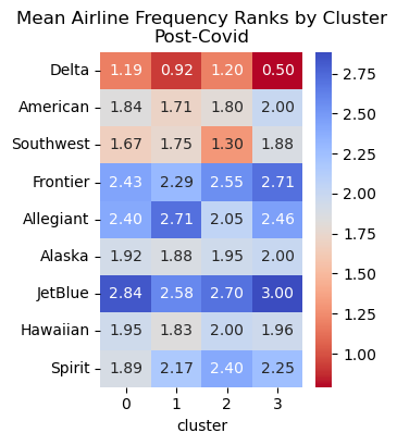
Airline Frequency Heatmap
Below are the frequency heatmaps for each of the commercial airlines broken out by cluster. Lower numbers indicate that respondents in that cluster fly with a given airline more frequently.
Notice: Spirit and Hawaiian airlines are not included in the Pre-Covid heatmap because none of the respondents provided answers to either of those survey questions in that split of the dataset.
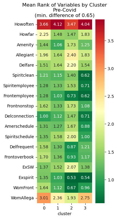
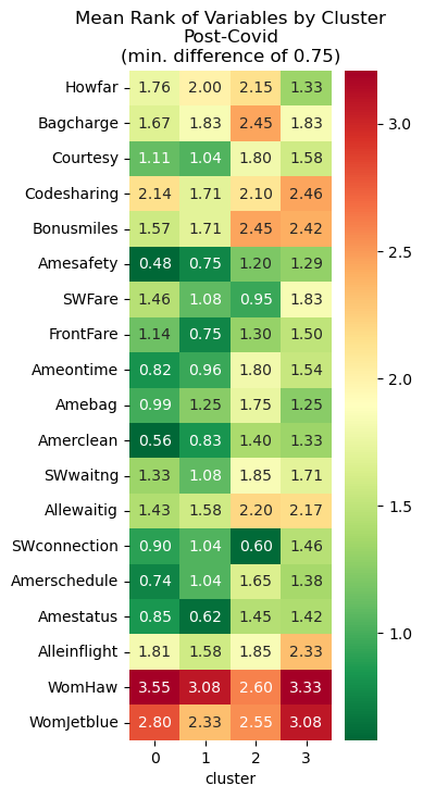
Differentiating Variables Before/After
To understand which variables differed between the clusters, I used the heatmaps shown below. I first calculated the average value for each of the survey questions grouped by each cluster. Then, for each variable, if the clusters with the highest and lowest values didn’t differ by at least a specified threshold (these thresholds are listed in the plot titles), they were filtered out. In other words, only variables that had higher differences between clusters were included to show which survey responses differentiated the four groups.
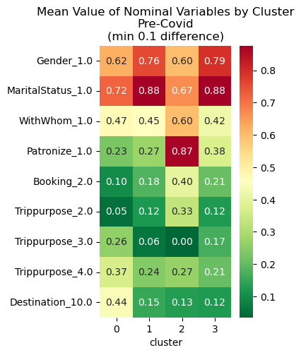
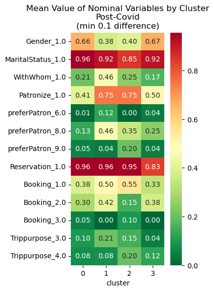
Nominal Variables
Nominal variables were factored into dummy variables on a binary scale. Thus, they would not have been included in the previous heatmaps. Following the same setup, the heatmaps below show the same comparisons using only these variables.
Pre-Covid Cluster Profiles
Cluster 0: Loyal and Frequent Flyers
Key Characteristics
- High Travel Frequency: Respondents in this cluster tend to fly very often (as indicated by lower frequency values)
- Positive Experience: They consistently rate key aspects (e.g., safety, service, reputation) very favorably
- Demographics: There may be a higher proportion of males and married individuals
Actionable Insights
- Enhance Loyalty Programs: Focus on rewarding frequent travel with exclusive benefits
- Maintain High Standards: Continue to deliver excellent service and safety to keep this loyal base satisfied
- Personalized Engagement: Use targeted communication strategies to reinforce brand affinity
Cluster 1: Occasional, Price-Conscious Travelers
Key Characteristics
- Lower Travel Frequency: These respondents fly less often (indicated by higher frequency ratings)
- Moderate Experience Ratings: They give decent but not outstanding ratings on service and safety, suggesting that cost may be a more important factor than premium features
- Decision Drivers: Price and convenience likely play a larger role in their airline selection
Actionable Insights
- Promotional Offers: Develop and market competitive pricing, discounts, or bundled packages
- Value-Driven Messaging: Emphasize affordability and value without compromising essential service quality
- Feedback Loops: Regularly solicit feedback to fine-tune offerings and address any cost-related concerns
Cluster 2: Critical, Experience-Focused Flyers
Key Characteristics
- Frequent Flyers with High Expectations: Although they may fly often (low frequency values), their ratings for service, safety, and overall experience are higher (indicating more negative perceptions)
- Vocal and Influential: They are likely to express their opinions via word-of-mouth, potentially affecting broader public perception
Actionable Insights
- Service Recovery Initiatives: Identify and address pain points through targeted quality improvements
- Enhanced Training: Invest in staff training and operational refinements to improve customer experiences
- Reputation Management: Proactively monitor social media and reviews, and engage with this segment to mitigate negative word-of-mouth
Cluster 3: Balanced, Nuanced Travelers
Key Characteristics
- Moderate Travel Frequency: This group flies an average amount—not as frequently as Cluster 0, but more than Cluster 1
- Mixed but Thoughtful Responses: Their ratings are balanced—not extremely high or low—suggesting nuanced opinions where both cost and service quality matter
- Adaptable Preferences: They may be influenced by a combination of service quality, pricing, and overall airline reputation
Actionable Insights
- Tailored Offerings: Develop flexible packages that strike a balance between cost and quality
- Continuous Monitoring: Keep a close eye on changing preferences and trends within this segment
- Engagement Strategies: Use targeted surveys and communications to better understand their evolving needs and refine service delivery accordingly
Post-Covid Cluster Profiles
Cluster 0: Loyal, Frequent Flyers
Key Characteristics
- High Travel Frequency: Respondents in this cluster generally have low numeric frequency scores, implying they fly very often.
- Positive Perceptions: They provide consistently lower (more positive) ratings on airline-specific aspects (e.g., safety, service, reputation).
- Demographics: There appears to be a trend toward a higher proportion of males and married individuals.
Actionable Insights
- Loyalty Rewards: Strengthen frequent flyer programs and offer exclusive benefits to keep this core group engaged.
- Consistent Quality: Ensure that high service and safety standards are maintained to support their positive experiences.
- Tailored Communication: Use personalized marketing based on their travel history to reinforce brand loyalty.
Cluster 1: Occasional, Price-Conscious Travelers
Key Characteristics
- Lower Flight Frequency: These respondents score higher on frequency values, indicating they fly less often.
- Moderate Ratings: Their ratings on service, safety, and reputation tend to be middling—suggesting that while they value quality, cost is likely a major driver in their decision-making.
- Cost Sensitivity: Their decision process appears to be driven more by ticket price and convenience rather than premium service.
Actionable Insights
- Competitive Pricing: Design and promote discounted fares, bundled offers, or seasonal promotions to attract this group.
- Value Messaging: Emphasize the balance of affordability and essential service quality in marketing materials.
- Feedback Channels: Create simple feedback loops to understand their needs better and to refine value-based offerings.
Cluster 2: Critical, Experience-Focused Flyers
Key Characteristics
- Frequent Travelers with High Expectations: Although they may fly often (lower frequency scores), their ratings on service, safety, and overall experience are notably higher—indicating more critical perceptions.
- Influential Opinion Leaders: Their detailed and less favorable feedback suggests they’re highly engaged and likely to share their opinions with others.
- Demand for Excellence: This group expects superior quality and may be particularly sensitive to any declines in service standards.
-
Actionable Insights
- Service Recovery: Identify key pain points and proactively address them through enhanced customer service initiatives.
- Quality Improvements: Invest in staff training and operational adjustments to elevate the overall travel experience.
- Reputation Management: Monitor social channels and review platforms closely, and engage directly with these customers to mitigate negative word-of-mouth.
Cluster 3: Balanced, Nuanced Travelers
Key Characteristics
- Moderate Frequency: Respondents in this cluster show average flight frequency—not as high as Cluster 0 but more than Cluster 1.
- Mixed Feedback: Their ratings tend to fall in the middle range, suggesting a more balanced view where both cost and quality influence their travel decisions.
- Versatile Preferences: They appear adaptable and might value different aspects (price, service, reputation) depending on context.
Actionable Insights
- Flexible Offerings: Develop mid-tier packages that blend competitive pricing with satisfactory service levels.
- Targeted Surveys: Use more granular surveys or focus groups to pinpoint specific needs and fine-tune offerings.
- Adaptive Engagement: Craft marketing strategies that can shift focus between cost-efficiency and service excellence based on emerging trends.